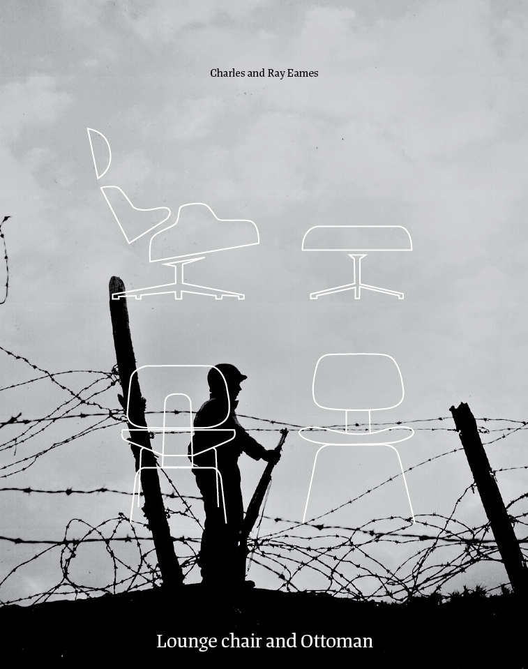
My catalogue is Inspired from an essay I wrote for college. The catalogue highlights the necessary essentials to survive. Food, water, and shelter that was needed by men at war and for their families at home. As the world progressed away from war so did the known basic essentials. After the war tastes were believed to need improving. There was this idea to be better and appear better, your home reflected that, which is where Good Design comes in. The catalogue explores the idea that consumerism is a materialistic antidote to war. It’s how the world gets over war and shifts its focus from the pain and suffering that is happening right under their nose.
ENDPAPERS
Using juxtaposition, I created a pattern of the famous Eames chair against two men in combat.
CONTENTS + CHAPTER OPENING
Each chapter opening has an assigned chair designed by Charles and Ray Eames. The number of the chapter overlaps the chair, the placement of the chapter number is consistent with the contents page. The illustrative chair expands across the page.
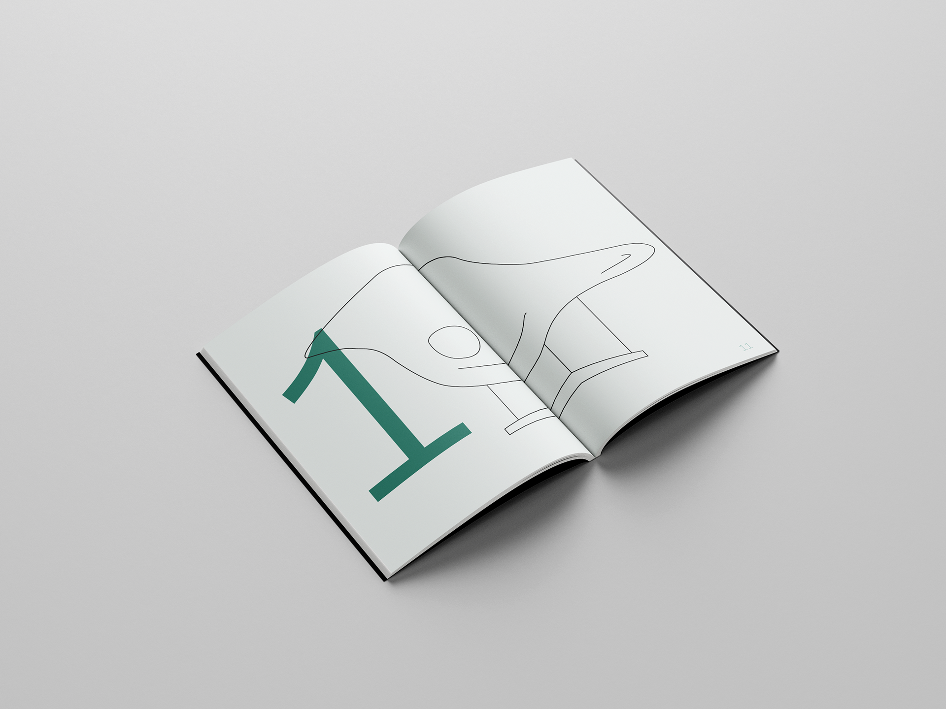
IMAGE + TYPE PLAY
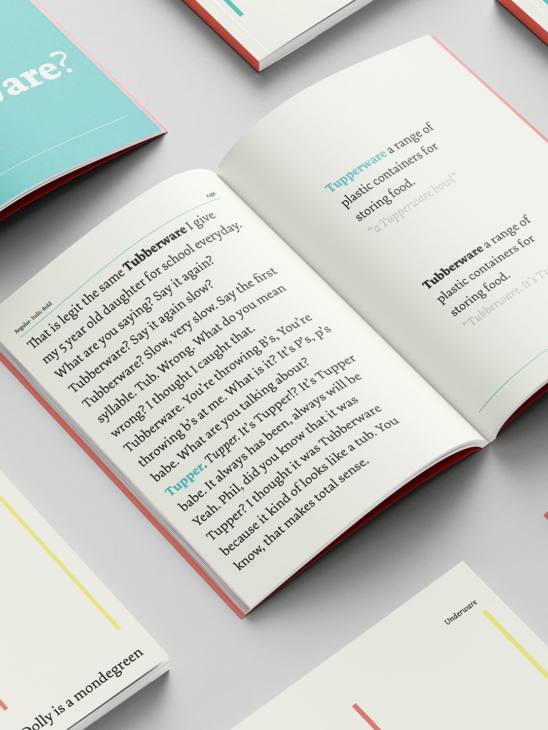
I wanted to explore using copy to create a relationship between text and image. Simple treatment of type to convey the "basic essentials".
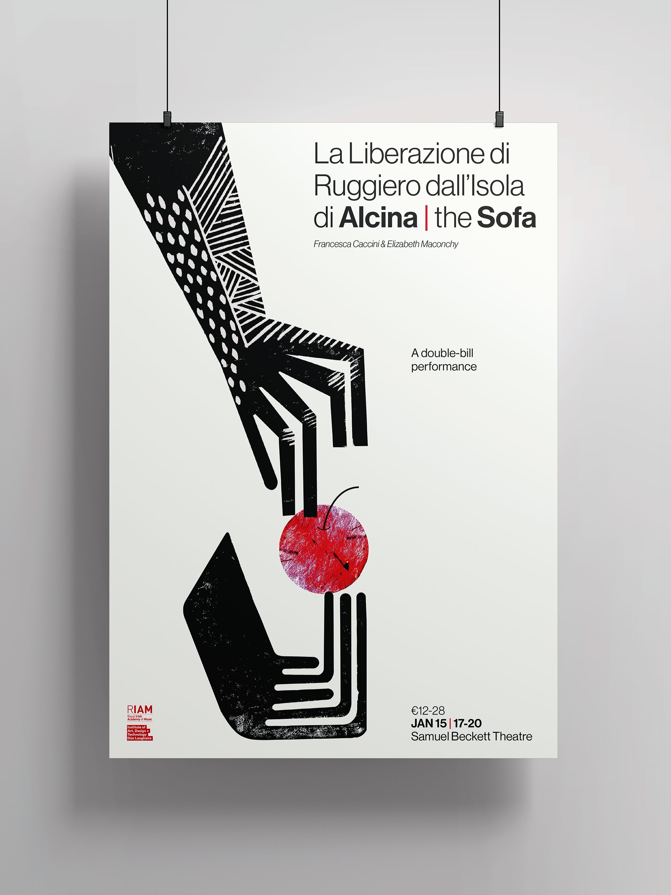
TABLOID + POSTER TREATMENTS

